
Discover all the affiliate secrets from the mVAS perspective!
Affiliate marketing from Beginner to Advanced
-
Part 1 - The basics of affiliate marketing
-
Part 2 - The affiliate network
-
Part 3 - Tracking Lessons
- Intro
- Adding Golden Goose network to your tracker
- Adding Golden Goose offers to your tracker
- Placing a Global Postback
- Placing postbacks for individual offers
- Adding landing pages to your tracker
- Adding Traffic sources to your tracker
- Building a campaign in your tracker
- Configure traffic back Campaign URL
-
Part 4 - Market Research and landing pages
-
Part 5 - Pop Traffic
-
Part 6 - Push Traffic
-
Part 7 - Additional Resources
Creatives
Before starting your first push notification campaign, I want to quickly go over how push notifications work in terms of creatives.
As opposed to pop traffic, where your only creative is the landing page itself, you’ve got to understand how push notifications are made.
At the beginning of this guide, I show you how push notifications look on different devices, however, when you’re creating your push notifications in a traffic source, there are four components you need to understand:
- Title/headline
- Description
- Icon
- Image
Those four components make a push notification ad, and they can make or break your campaign.
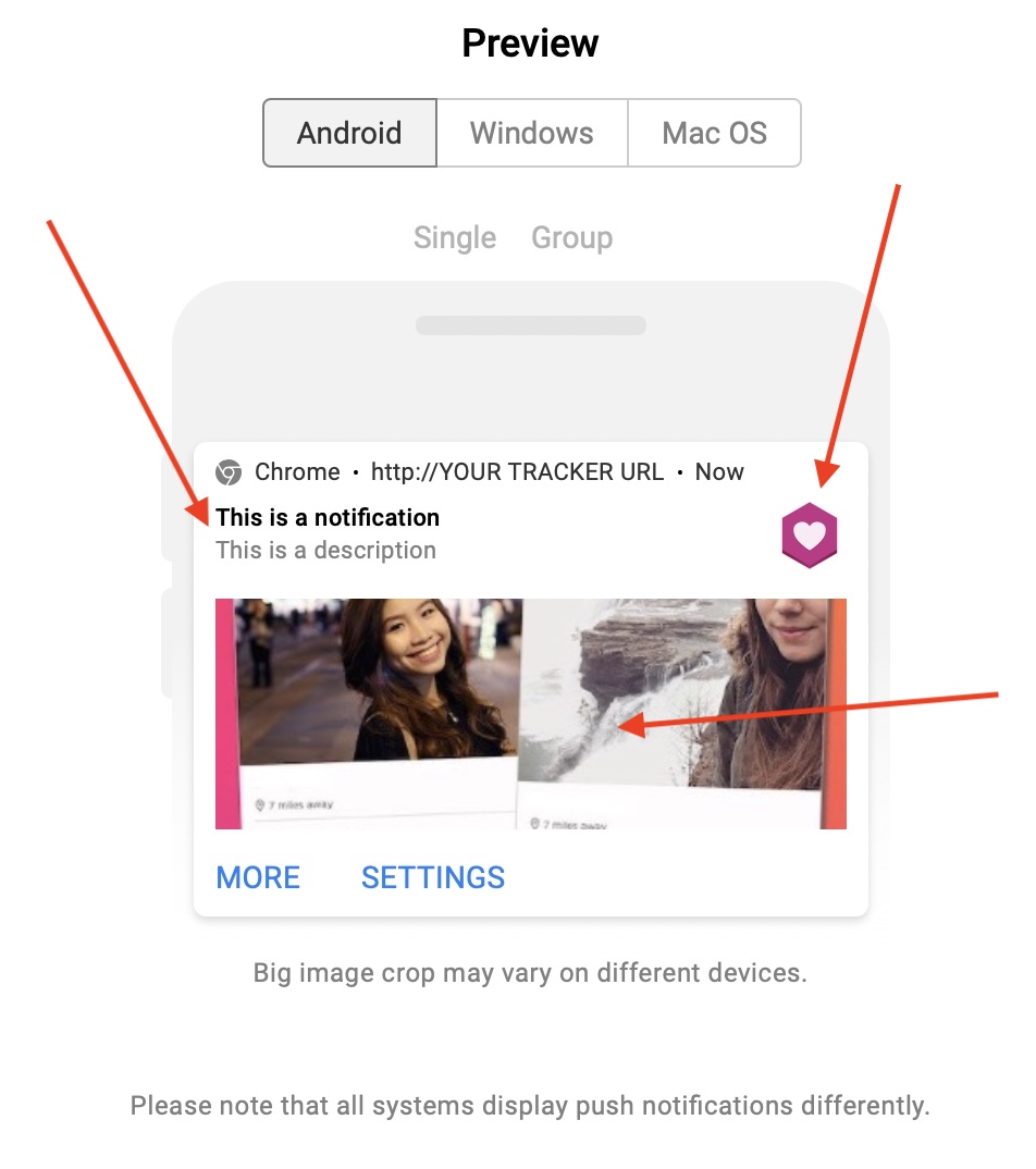
While all of them are pretty much self-explanatory, I want to mention a couple of things. First, the title and description are text only, but in many traffic sources, you can add dynamic tokens there that are replaced according to the user’s situation.
For example, the {city} token is replaced by the name of the city where the user is opening the notification from.
Or you can use the {browser} token to mention the specific browser receiving this notification.
Use them wisely.
The second thing I want to mention here is the image. While in the picture above the image looks like the biggest component of the ad, in many cases the image isn’t shown unless the user opens it.
This happens on Android devices when a user expands a notification, but most users don’t even do this. Also, some browsers don’t even support images, so there are only three components.
Therefore, the headline/title and the icon are the most important components of a push notification ad. Use them wisely to attract the click and pre-sell your offer in your description or landing page later.
The icon and headline are going to define your click-through rate (CTR), and usually the higher it is, the more chances you have to get cheaper traffic into your funnel (and more volume).
Now that we have gone over how push notification creatives work, let’s create a campaign!
Search
 Searching...