Salvador’s Guide to Amazing Creatives in mVAS
Greetings, art enthusiasts! And welcome to our lecture on how to craft paintings creatives that will move your audience and make them click that coveted button.
As Salvador Dali said:
That’s right, you, webmasters, are 21st century artists. And your job is inspiring others to move towards their dreams… and of course to dating beautiful women, who by the way are always in your area and just dying to meet you.
Taking this vertical as an example, we’ll take you through some basic mVAS tools and show you how to make eye-catching creatives.
Part 1. Push Harder!
Starting with Push ads. They work great in mVAS. So much so that sometimes you can do without a pre-land! Let’s get to cracking the secret to creating the perfect push once and for all.
Creative Formula

Real person. An imitation of a real person with a phone number and a real… well, only slightly edited photo. It looks so real that you only have to enter your number and a 4-digit SMS code to get in touch!
An informative approach. This combo must always include a pre-land. The article can be an exciting «How we met» story about a happy life of an old man and a charming young beauty or a divorced lady and a handsome guy. And there should be a picture of their family, children, beautiful house, etc. All this thanks to what? That’s right, an exclusive mVAS dating offer from Golden Goose! How can you not fall for that?
Incoming message imitation. A timeless classic. Tested over the years, it just works. We were taught that girls don’t text first. But at mVAS, it’s not like that. The girls are in such a playful mood when on their phones that they always message first. Creativity and experimentation are key. GG tip: Ask girls how they usually text guys!
Ethnic group focus. Everyone knows that Thai women are dreaming of meeting old, fat and rich westerners, and German men do not mind sheltering Ukrainian girls — purely to help them out, of course. Ask your traveling friends which countries have these kinds of combos. You can also go with goth girls, e-girls and other high CR sub-cultures!
Incoming voice message. Another timeless classic. You can’t help but to be curious how sweet and youthful Mary’s 20 y.o. voice sounds. The Goose specialists suggest playing with the time settings. Find out what time the respectable family guy Mr. Scholtz from Munich has his lunch break or whether he prefers listening to sexy voice messages as a bedtime story at 23.00.
Dating app imitation. A well-known and familiar to many people, and therefore working method. It may be perfect for mVAS, because offer pages often look just like dating apps.
Pic + Name. Industry’s staple. Such creatives are all about a luscious photo, age and name. Top-level stuff, no unnecessary details. Just be sure to check the most popular names in your target GEO. Because it’s kind of weird to see Anastasia or Deborah in Tanzania, Kenya, and Zimbabwe. Unless she’s been kidnapped and it’s a subscription-based ransom. Just kidding.
Video imitation. The key here is to find the right still frame, so that the play button conceals what you urgently need to examine more closely. Works like a charm and it’s not hard to hit a pause even with one hand!
Loneliness exploit. The insight that is never going to be obsolete because the world will never run out of lonely people who need emotional support. «Why are you so sad?», she asks, and in the meantime, you set your targeting to Marriage status: single or divorced. Works both for men and women. Remember — evening is the best time for sadness.
Oh, and don’t forget to add artificial restrictions on age, income or GEO, because exclusivity generates curiosity and an income for a smart webmaster. Entry not even from 18, but strictly from 21. Only for self-assured Europeans and wealthy ladies (targeting updates: office workers and entrepreneurs here).
The devil is in the details, and even the tiniest ones can drastically change the outcome of your campaign. It’s obviously a good idea to match your audience’s language and to spend some time editing real photos instead of using the stock ones. Also, come up with original copy and make everything look just like it’s an actual social UI.
If you feel that the CR is low, although there are a lot of clicks — ask your manager for a list of offers with a different flow type. Remember — mVAS has instant subscription flows from just 1 to 3 clicks. Sometimes you need to keep it simple and choose those where everything is already filled in for the user.
Part 2. Make it POP!
Pops. Pop-unders. Direct click. Different names for the same thing.
Pops are twice as effective as push, but also twice as difficult. We always advise to use pre-lands with such offers. Otherwise, there is a high risk that ROI will be lower than expected. Although here our media buyer easily managed to make it without a pre-land in Peru and earn 180% ROI with RichAds.
A miracle? No, it’s mVAS, baby!
Here, the formula to a converting pre-landing page is as follows:
Creative Formula
Language & Grammar. A user who sees poor grammar is a 99% lost click. A user sent to a pre-lander with a wrong localization is a 100% lost click. So be extra careful with the copy, as the slightest mistake may cost you. Notice how we used “may” here — that’s actually another tip: try to avoid affirmative wording so as not to mislead users. Use “may, can or might win” instead of “you will definitely win”.
Interactivity. Static pre-lands are boring, so try using interactive elements. Here’s an example of a gift box pre-land. User clicks 3 random boxes and then gets sent to a landing page for more. Simple and effective.
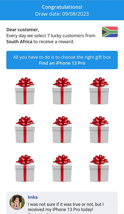
Imitation. Take another look at the screenshot above. Does your brain recognize something? The comments are just like those from a certain social network. Wow, it must be 100% legit! So another useful technique is copying the UI and style of trusted and well-known websites, this adds credibility to your creative.
Note: some ad networks prohibit the usage of popular icons and logos, but you can override this by changing a color or rearranging some elements, so that the logo is different, but still recognizable.
The most valuable tip we would give on mVAS pops is keeping it simple. Remember, the mobile screen space is limited, so try not to overcrowd it with unnecessary information or art. It doesn’t mean that your ad shouldn’t look pretty, just don’t overdo it.
Another cool creative solution is a picture and video with a person who receives a payment (gift) and shows emotions on camera. The guys from betting often use this technique, but the market is so overheated that it is 10 times harder to achieve a positive ROI there than in mVAS.
The main thing is that the person in the video should be of an ethnicity that makes sense for the target GEO. Just loop the video and you have a great pop-under with a cool offer.
Well, if you don’t want to bother, there’s a versatile design that works almost every time. We just recently talked about it in a case study in Indonesia.
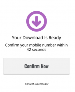
Looks simple, right? Probably the simplest $200 for our media buyer. Too bad goose has a strict rule of not making money on its offers, we only test them for you with the most basic creatives.
Most importantly, don’t forget to use spy tools! For example, Adplexity is full of ideas and more.
Part 3. Go Deep In-Page!
This format is also called social bar on some platforms or icon notification. The creatives here are as simple as in push ads, but you should keep in mind that the message must look real. Or you can mimic a system notification stating that the phone is being hacked by a virus, and it will be completely virus-free for only 20 TZS per day.
So, let’s break down how to make effective creatives for gaming offers. They can be as simple as «You’re a champion!» in the headline and «Hey gamer! Play games and win prizes!» in the subhead + a simple icon.
Told ya, it’s always simple in mVAS!

Guess which creative worked better?
We already know! Read our case-study.
By the way, our media buyer made $600 in 20 days, or $30 a day. 2 sentences and 1 picture… Can you do that in Crypto? It’s just one of dozens of campaigns that convert like clockwork. $30 today, $30 tomorrow, and so on and so forth. Welcome to mVAS, guys.
SPOILER: You haven’t read our case, have you? The correct answer is #2.
Part 4. Barge in with Interstitials!
It’s a legendary format that works great for sweepstakes, dating, soft, and many other topics in mVAS. Interstitial ads take up the whole screen space and are usually inserted in the natural user flow, between the steps. They can also be placed inside games between levels.
All in all, interstitials have better visibility, and therefore, better CTR. Your job is to make an ad to fit the selected vertical and keep in mind that the chances of a click are 50/50. Either the user clicks or closes it. Here’s a formula you might find useful:
Creative Formula
Clear message. Since you already know that a user will see your ad, you want to back up on your tone a bit and just plainly tell them what your offer is about. If It’s a video format, cut to the chase without lengthy introductions, as some interstitials can be closed just after a couple of seconds.
Incentive to click a button. Interstitial ads usually come with a choice of buttons. Play with the wording on them to make the user decision not so obvious. For example, an “OK” button is usually brighter than a “Close” button. You can follow this familiar pattern, or you can switch it up and highlight the “Close” button with an ambiguous text on it to trick a user into thinking that this button is the “OK” one, so they instinctively push the less pronounced real “OK” button, which is exactly what we want.
Offer-related art. If your ad looks like what you promote, you have better chances of conversion, it’s that simple. For instance, if you’re promoting a subscription-based video streaming service, do a research on what is popular in your target GEO and place these posters on your Interstitial.
Here are some good examples of interstitial ads:
Part 5. Keep Pre-rolling!
Despite sharing the name with something the US and Canada citizens can legally enjoy, pre-roll ads are short videos played before the video a user actually wants to watch. And you guessed it, they are used whenever there’s a video player involved: Adult, Games, Streaming, or Education.
There are 3 kinds of pre-rolls:
- Non-skippable ads work great with the CPM model, and if you can keep users engaged with your creative, you are likely to get more out of it.
- Skippable ads can be closed after several seconds from the start, so you have to be quick to hook your audience. With these ads, you get paid if the user watches the video in its entirety.
- Bumper ads are 5-6 second long videos perfect for the mobile format, and it is advised to use those for mVAS offers.
The formula for a quality pre-roll would be:
Creative Formula
Attention-grabbing start. You have to keep in mind that users don’t actively look for an ad to watch, but they don’t mind a little entertainment or useful information. Try to incorporate an element of surprise into your creatives, to make them memorable from the get-go.
Catering to user’s preferences. It is a good idea to test different tags of the videos and make creatives that would make a user continue watching your ad, because they’re already engaged when they click on a video they want to watch, and your job is not to break that engagement, but to boost it. This is especially important for adult pre-rolls, because you want to capitalize on the user’s excitement, not to make them soft and annoyed.
Strong CTA. CTA is key in any kind of video advertising, so make sure that it is clear and unique. You can even start your pre-roll with a CTA. Remember, we don’t have much time here.
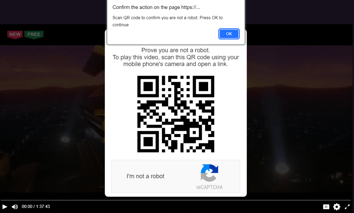
We’ve got a really nasty preroll for you to demonstrate how powerful they can be. Let’s say you click a link to watch some movie online and it takes you to a player with a familiar intro:
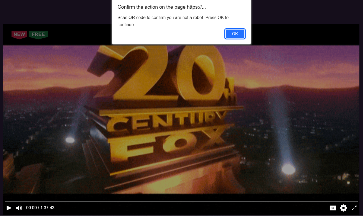
The footage then immediately stops, and you are forced to click the OK button. However, when you do this, the preroll goes full screen and plays an annoying voice message telling you to scan the QR code. Nope, pressing Esc, Win or Alt+Tab won’t help. If you don’t know how to get out of this, you’re pretty much caught and have to scan the code.
Part 6. Blend in with Natives!
Native ads are an effective tool for any affiliate, as they let us play with the user minds. These ads disguise themselves so well, one cannot tell a website’s content from an ad. Is that a real video or an ad? You won’t know unless you click it, and when you find out, you’re already caught.
Native ads are especially sensitive to a kind of offer you promote. They have to closely match the audience of the website they’re posted on, and the content should be top-notch. When users click your ad, they must see a sharp-looking landing page or an informative blog post, or a high-quality video. In the end, the content must lead to the solution of their problem, which is making the purchase.
Creative Formula
Eye-catching image. This is pretty much self-explanatory. You can use either one of the images provided by the offer itself, or make a custom one to have more control over what you want to place on it. A single image is usually enough.
Clickbaity title. The title is what makes a user click your ad. Therefore, you must research your audience and make it so that they can’t resist clicking the title. And it also should work in tandem with the image.
Matching the website style. As we already mentioned, your ad should be indistinguishable from content, so look at the real pieces on the website and copy their style.
Also…
An artist should not only be able to paint, but to count as well. If it wasn’t for Gala Dalí, the maestro would have squandered all his savings on partying and drinking — which we also deeply respect! Different platforms have different percentages of bot traffic.
Do not listen to those who say that it’s format-dependent. Organic loss depends on the network. The standard loss rate is 3-5%, but it can reach 10% and even 15% in some GEOs. You should start worrying if it goes beyond 15%. Stop such campaigns, no mercy.
So, you’ve read it all but still have questions? And you should! Here’s a full-length video where we explain creatives with live examples.




 Searching...